Tutorial - Building Blocks
General ·I’m pleased to introduce my first tutorial entry, focused on the core building blocks: shapes, images, and text. You will learn how to create and align these core building blocks to create your own custom template in Card Creatr Studio. I also introduce variables and basic scripting.
Card Creatr Studio templates are written with SVG and Pug.
What is SVG?
Card Creatr Studio uses the SVG markup language to create templates. SVG stands for “Scalable Vector Graphics”. SVG is a language that allows you to dictate shapes to render on your playing card; Card Creatr does the rest of the work of following the instructions in the template to create the final rendered card image.
SVG uses an X/Y coordinate system, except that unlike what you learned in high school, the y dimension goes down, not up. Illustration:

What is Pug?
SVG requires that you write your markup in XML. However, XML is not the nicest langauge for humans to use. Pug, previously known as Jade, is a templating language that allows you to write simpler markup that gets translated into full XML for SVG to consume.
For example, SVG requires the following input to create a rectangle:
<rect x="5" y="5" width="20" height="20" fill="black" />
In Pug, the same can be written as:
rect(x=5 y=5 width=20 height=20 fill="black")
Pug also exposes the full power of JavaScript, which will come in handy in the “Variables” section later in this tutorial.
Getting Started
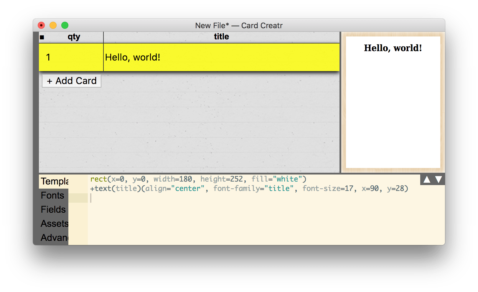
The simplest building block is a rectangle. To demonstrate, start by creating a new empty file in Card Creatr Studio. The default template contains two items: a rectangle and a text element.
rect(x=0, y=0, width=180, height=252, fill="white")
+text(title)(align="center", font-family="title", font-size=17, x=90, y=28)
The first line creates the white background. It is 180pt wide and 252pt tall. “pt” means “point”, a unit used in page layout; there are 72 points in an inch. A 180-by-252-point rectangle is 2.5 inches by 3.5 inches, a standard poker-sized card.
The second line creates a text placeholder. The text placeholder is at x=90pt, so it is centered horizontally (the card is 180pt wide). The y coordinate for text is relative to the text’s baseline, as illustrated below:

Therefore, by making the font size 17pt and the y positioned at 28pt, we leave around 11pt (28pt–17pt) between the top edge of the card and the top of the text.
Elements vs. Functions
You may notice above that the word “text” is preceeded by a plus sign, as in +text, but the word “rect” does not have a plus sign. The plus sign indicates that the line may actually get expanded to a different underlying SVG string via a helper function. Since rect is an official SVG element, it does not need a helper function. There are several helper functions in Card Creatr, which help cover functionality that is unclear or difficult to perform using plain SVG elements:
+text+textWrap+imageFill+imageFit+imageStretch
For example, the above +text example expands to the following SVG XML, which actually renders the text left-aligned from a calculated x coordinate:
<text x="34.355712890625" y="34" font-family="title" font-size="17">Hello, world!</text>
Using +text also allows Card Creatr to render the text as SVG paths. For more information, see the “fontRenderMode” option in the “Advanced” tab.
Examples of all five of these helper functions are shown throughout this tutorial page.
Adding Our First Rectangle
Let’s create a new rectangle that leaves 12pt around the edge of the card. The coordinates need to be as follows:
- x: 12pt
- y: 12pt
- width: 156pt = 180pt (card width) – 12pt – 12pt (edges)
- height: 228pt = 252pt (card height) – 12pt – 12pt (edges)
The markup is:
rect(x=12 y=12 width=156 height=228 fill="blue")
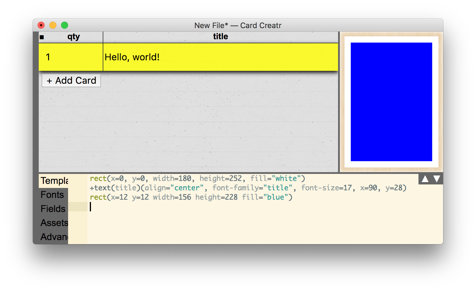
Uh-oh! Our new blue rectangle is hiding our title text! This brings us to another important rule in SVG:
Elements later in the template file appear above elements earlier in the template file.
Let’s fix this by moving our blue rectangle between the white rectangle and the text box:
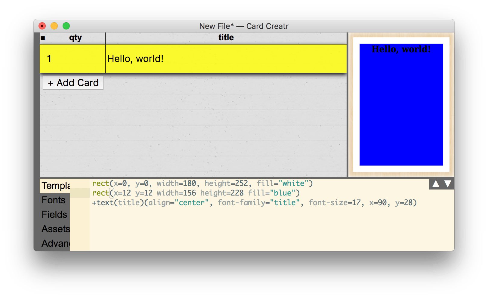
We can now see our text in full! Don’t mind the colors; we can fix that later.
Using Variables
We have three elements: the two rectangles and the text field. Our dimensions 180pt and 252pt are already duplicated several times in our template markup! We can fix this by abstracting these dimensions into variables. Pug allows us to define JavaScript variables on lines starting with -; this is also how you write any JavaScript code in Pug. We can simplify our template to the following:
- cw = 180  // card width
- ch = 252  // card height
- m = 12    // margin

rect(x=0, y=0, width=cw, height=ch, fill="white")
rect(x=m y=m width=cw-2*m height=ch-2*m fill="blue")
+text(title)(align="center", font-family="title", font-size=17, x=cw/2, y=28)
If we wanted to change the card width, card height, or margin, now we need to do it in just one place!
The syntax // means a “comment” in your template: the text that follows the // is ignored until the next line.
Images
Next, let’s add an image to our card.
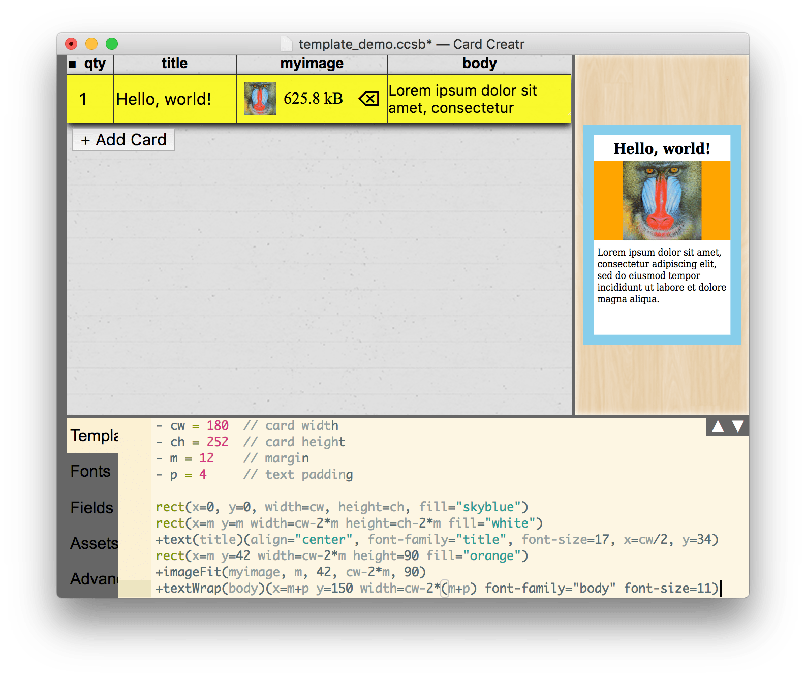
Before we do the image, I’m going to clean up our template a little bit:
- cw = 180  // card width
- ch = 252  // card height
- m = 12    // margin

rect(x=0, y=0, width=cw, height=ch, fill="skyblue")
rect(x=m y=m width=cw-2*m height=ch-2*m fill="white")
+text(title)(align="center", font-family="title", font-size=17, x=cw/2, y=34)
rect(x=m y=42 width=cw-2*m height=90 fill="orange")
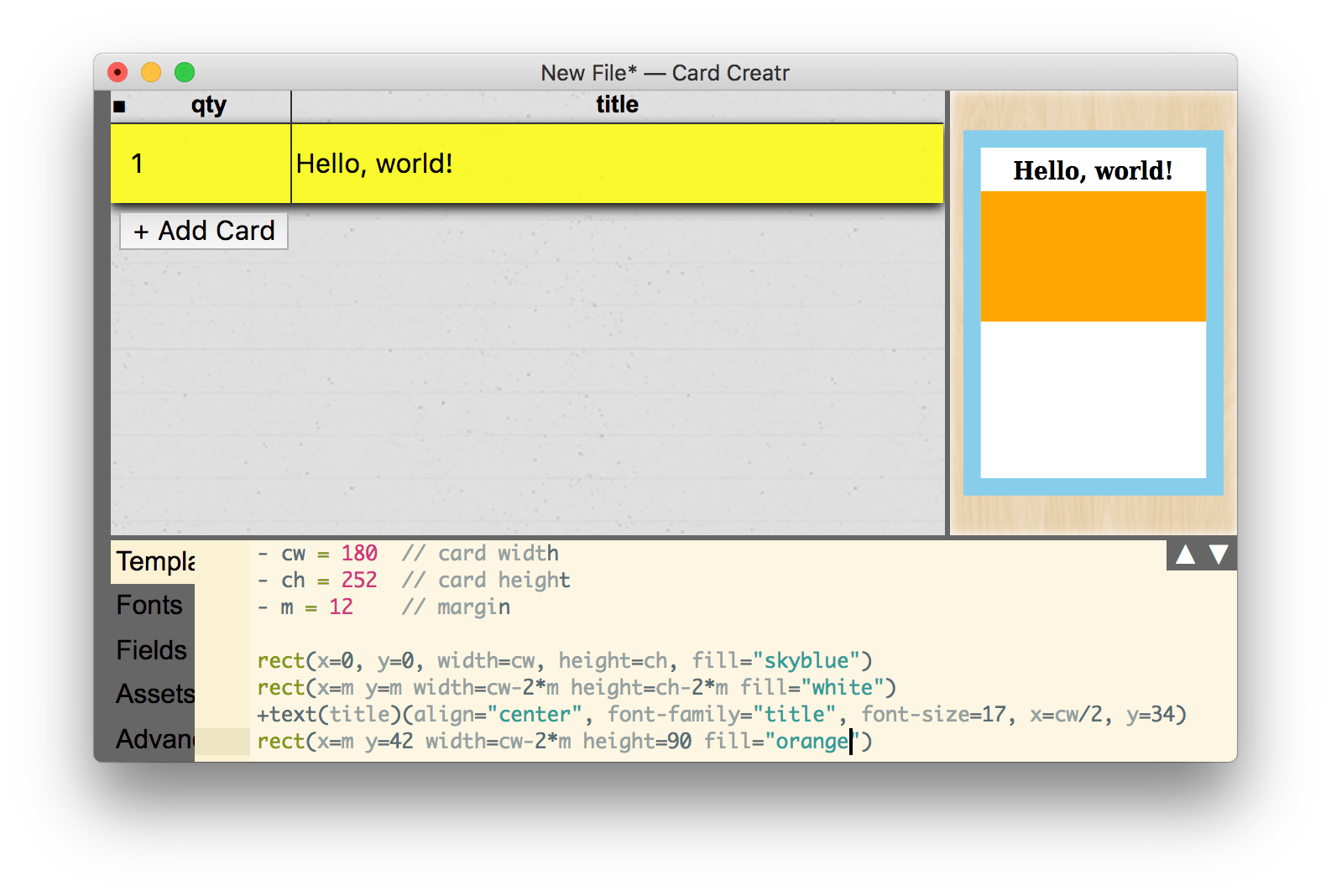
I changed the colors and created a new orange rectangle. Let’s put an image in that rectangle.
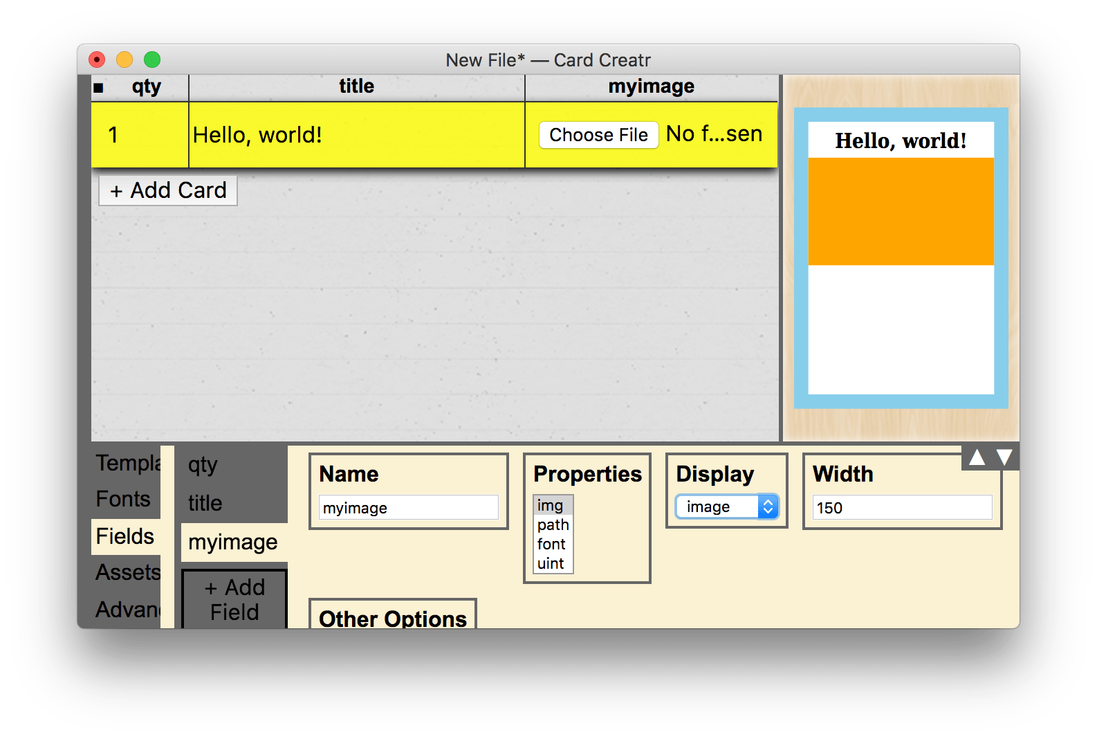
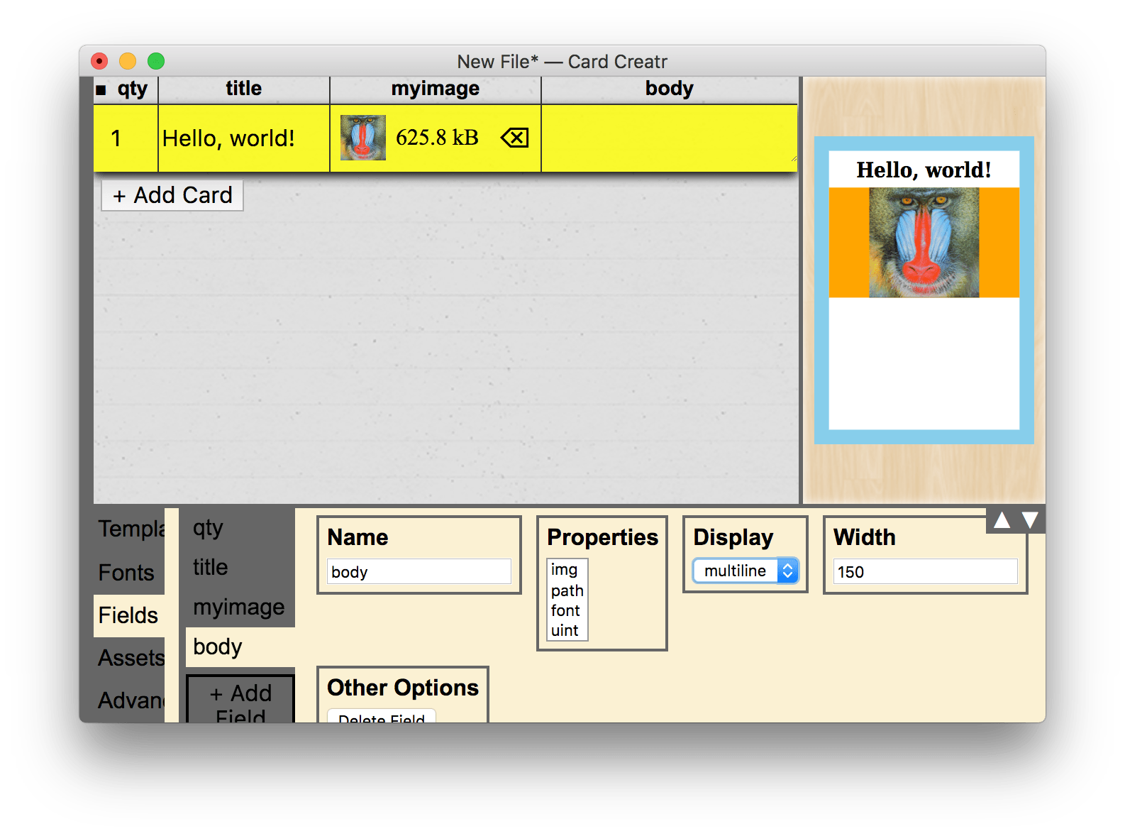
You will first need a field in your spreadsheet to insert the image. To do this, open the “Fields” tab in the properties pane, and insert a new field named “myimage” with property “img” and display “image”:
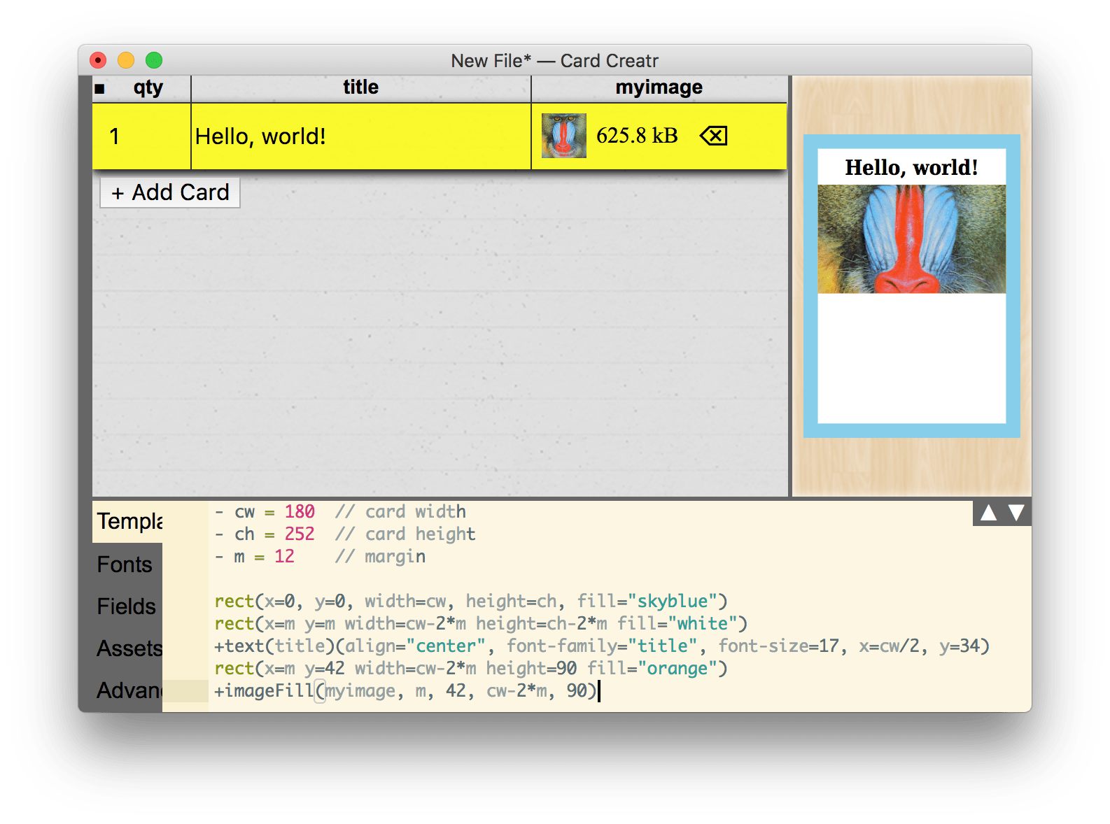
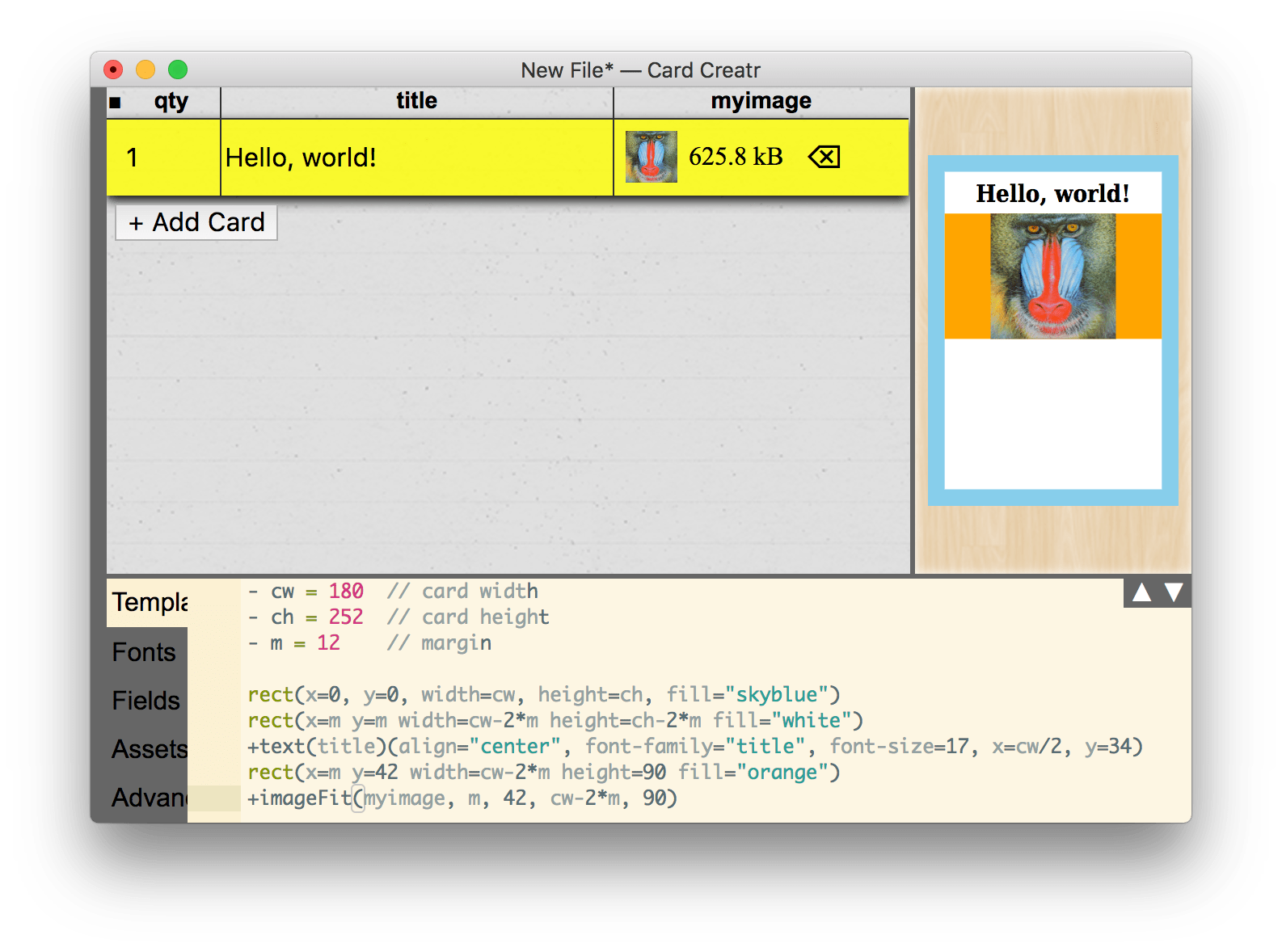
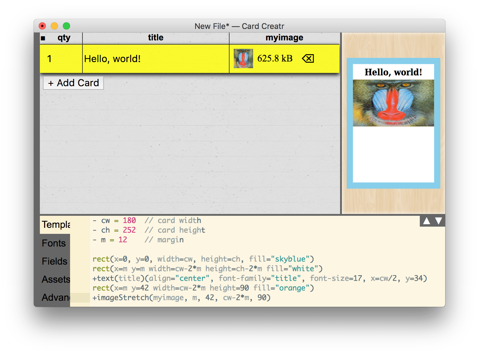
Choose an image, and return to the template. Now let’s insert our image. We define a rectangular area in which to insert the image, and then we can use any of the following three built-in image helper functions:
-
+imageFill, enlarges the image to fill a rectangular area, clipping off the edges of the image if necessary. -
+imageFit, fits the image into the rectangular area, possibly leaving part of the rectangle empty. -
+imageStretch, distorts the image to completely fill the rectangular area without clipping off the edges.
The markup for these helper functions is as follows:
+imageFill(myimage, m, 42, cw-2*m, 90)
where the parameters are given in the order x, y, width, and then height. Here is what happens with each of the three versions of the helper function:
+imageFill(myimage, m, 42, cw-2*m, 90)
+imageFit(myimage, m, 42, cw-2*m, 90)
+imageStretch(myimage, m, 42, cw-2*m, 90)
For this tutorial, let’s settle on +imageFit.
Body Text
Now it’s time to add some body text below the image. First, add a multiline field named “body”:
Now, add it to the template as follows, using the +textWrap helper function:
- p = 4     // text padding

+textWrap(body)(x=m+p y=150 width=cw-2*(m+p) font-family="body" font-size=11)
The +textWrap helper function is very useful because there is currently no option in the SVG specification for performing automatic line wrapping. The function computes the appropriate line wrapping widths and does the layout automatically.
+textWrap has the following custom options; the first three are also available in +text:
-
alignaccepts either"left","center", or"right"and controls the alignment of the text relative to the registration point. -
font-familycontrols the font itself; you must use one of the fonts available in the “Fonts” tab. By default, there are two fonts, “title” and “body”, which are actually DejaVu Serif. You can add more fonts in the Fonts tab. -
font-sizecontrols the text size. -
line-heightcontrols the spacing between baselines of text. -
paragraph-spacingcontrols the amount of additional space added between “paragraphs” (line feeds in the multiline text box in the spreadsheet).
Advanced: Scripting
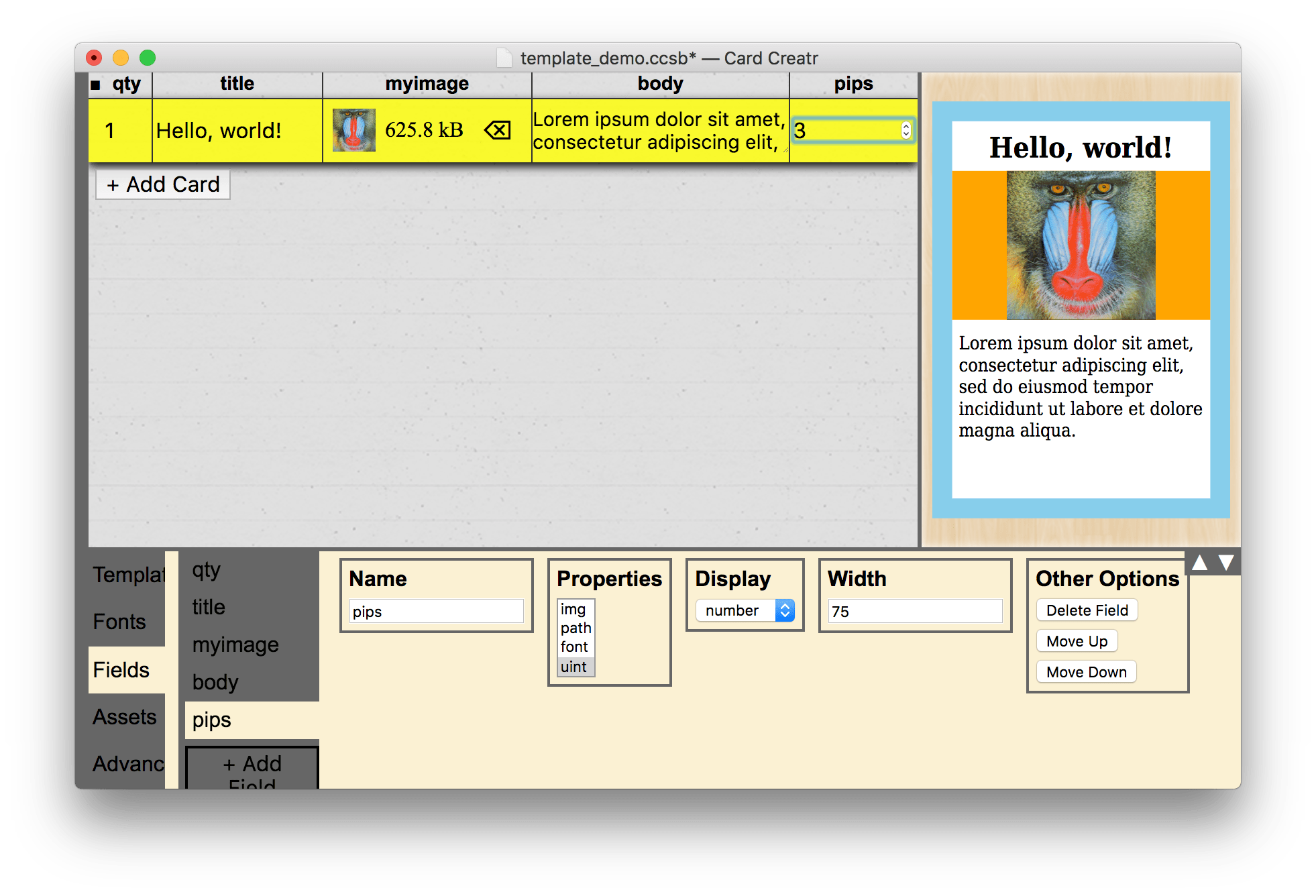
You’ve now mastered all of the basic tools for card layout. In this final section, I want to illustrate one of the most powerful features of Card Creatr Studio: the ability to use scripting. We will make a field to add a variable number of pips (circles) to the bottom-right corner of the card.
Start by creating a new field called “pips” with type uint and display number, and set a value of 3 in the card spreadsheet:
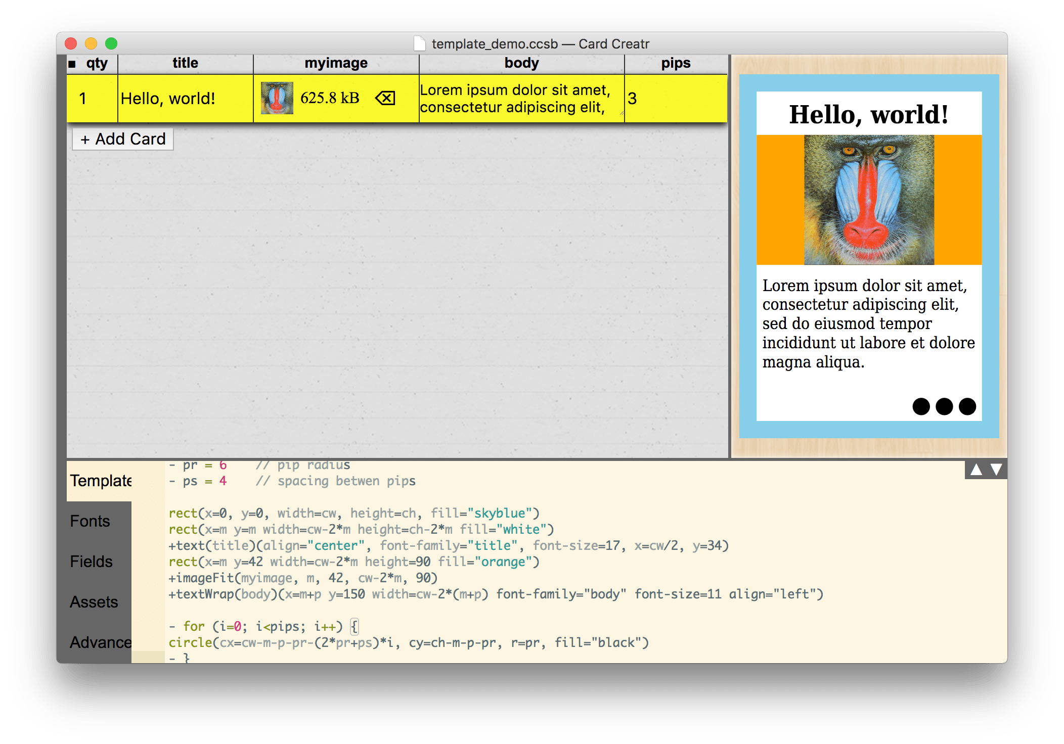
Now, add the following code to your template:
- pr = 6    // pip radius
- ps = 4    // spacing betwen pips

- for (i=0; i<pips; i++) {
circle(cx=cw-m-p-pr-(2*pr+ps)*i, cy=ch-m-p-pr, r=pr, fill="black")
- }
The first two lines set up two more variables that we can use. The third line with the for loop is JavaScript code that means, “copy the following line pips times”. The fourth line is the line that the for loop will copy, and it is the one that creates our circles. The math for positioning the circles is a little long, but it basically combines all of our other variables in order to have precise positioning of the pips. Note that circles use cx and cy instead of x and y in order to emphasize that the registration point of the circle is its center. The r parameter specifies the circle’s radius.
Here is what we end up with:
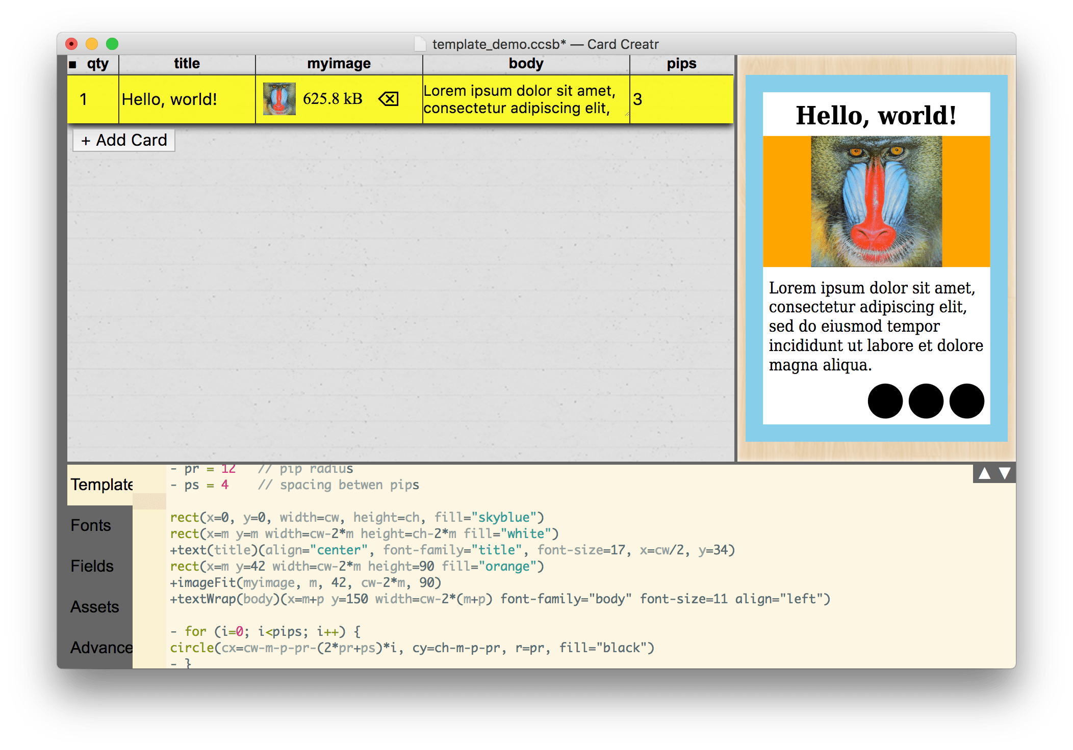
Since we used variables, changing the size of the pips is easy. Here is what it looks like when I set pr = 12 (notice that the circles are bigger):
Next Steps
The full power of SVG is at your fingertips with Card Creatr Studio. The MDN is a great online resource for learning all of the other things you can do with SVG:
https://developer.mozilla.org/en-US/docs/Web/SVG
If you have questions about how to make specific layouts with Card Creatr Studio, post a question on the feedback and support page, which you can access by clicking the “Feedback” link at the top of this web site.